Art Lesson - Color
A disclaimer The eighteenth century had the color triangle. The nineteenth century had the color wheel. The twentieth has the CMY system. CMY is proven a workable system. There is a discussion of it at the end of this lesson.
The Basics
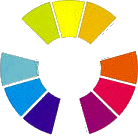
The Color Wheel
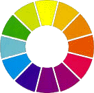 This is a color wheel.
It represents the full spectrum of colors, but
bent back on itself so both ends connect.
This particular wheel does not show the full gradations in the spectrum. Its shows the whole thing broken up into 12 segments. Of course the segments actually smear into one another so that we have an infinite number of colors.
Primaries
There are three primary colors. You cannot make primaries; you have to buy them. These are the three primaries:
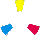
YELLOW
RED
BLUE
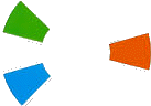
Secondaries
There are three secondary colors. You can make secondaries. You do not have to buy them. These are the three secondaries:
GREEN = BLUE + YELLOW
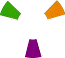
ORANGE=YELLOW + RED
PURPLE = RED + BLUE
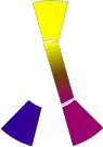
Mixing Your Secondaries Here is an example of this principle for mixing an orange. If you used an orange paint, (like cadmium orange), you would get a beautiful smooth orange.
Tertiaries
You need to memorize this primary / secondary stuff. Its not intuitive, and you are going to need to know it very well. You do not have to memorize it before reading on.
As we have just seen, you can mix secondaries by adding two primaries together. Mixed secondaries are much more interesting than Primaries. Using watercolors, the two pigments will settle out differently. As they do, they will separate into little aggregates and the surface will seem to shimmer. With oils or acrylics, if you do not mix the paints well, you get a similar shimmer . The principle applies in any medium.![]()
But if you mix your orange from a red and a yellow, then you get the same beautiful orange, but it can shimmer.
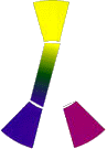
![]() Sadly, not nearly as much as this example (I fudged it some).
Sadly, not nearly as much as this example (I fudged it some).

We even speak of tertiary colors. They are the ones
in between the others. Like reddish orange.
Why then do painters have so many colors?
Alternatively, if you mix an orangish yellow with a orangish red, you will get a perfect, bright orange. So if we want to have a full range of colors, we need two of each primary. One a little off to each side. This is called the dual primary palette. (The word palette has two meanings to us artists. Its is both the thing you mix your paint on, and also your available selection of paints.)
Some pigments are very small, light particles. They settle on the paper very uniformly, and some of the particles get in between and under the fibers of the paper. These are called staining colors. They are almost always man made.
Other pigments have large, heavy particles. They settle out into the valleys of the paper creating a mottled or textured surface. These are the non-staining colors. They are almost always minerals. Watercolorists need a color range of both staining and non-staining colors
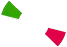
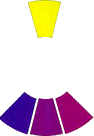
Complements
Complements are any pair of colors which are exactly opposite each other on the color wheel. These are the main complements: Blue-Orange
Yellow-Purple
Red-Green


Making A Dark
Complements, when mixed together in the right proportions always make a dark. I call it dark and not black, because even though it can be truly black it often doesn't look that way. It always looks dark. Complements always neutralize each other.
Take the Purple-Yellow complement. We can mix straight across the wheel, or we can mix a little off to one side, like these.
A true complement
Off to the reddish side
Off to the Blue side
I exaggerated the effect because your monitor may be different than mine and I want you to see it clearly.
The near darks are much more interesting than the true darks. Unless someone looks really closely they will read all three of the previous examples as dark. As with secondaries, at a subliminal level, they will love the added color. Using watercolors, the two pigments will settle out differently, and the surface will shimmer. With oils or acrylics, if you do not mix the paints well, you get a similar shimmer . The principle applies in any medium.
You do not need secondaries to make a dark.
Suppose you want to make a dark from the complements red and green.
First you might make the green, mixing blue and yellow.
Now add the red to neutralize the green. You now have your dark.
You did it by mixing blue, yellow and red. The three primaries.
Mixing your colors
You can make any color of the rainbow with the three primaries.
Except, No manufacturer can make a paint in a true primary color. People cannot even agree to exactly what a true primary is.
You can still make an excellent painting with three tubes of paint that are pretty close to the primaries. You will have a little difficulty getting one or two very bright secondaries.
Anyway, unless you are doing floral's or man made things, you will not have a problem. Other than flowers, true secondaries almost never occurring nature. As a matter of fact, your landscape paintings will likely be improved with only the three primaries. This is especially so if your blue is purplish, and your yellow is orangish.
![]() There is no way to mix a garish green.
There is no way to mix a garish green.
If it were the other way, greenish blue and greenish yellow.
![]() ..... Yuck for landscapes.
..... Yuck for landscapes.
I cannot recommend three primary paints to you. Each brand has a little difference. In the store, just unscrew the cap and take a look.
For a full color palette you will need 2 tubes of each primary. One off to either side of the color. That's how I do it.
I can mix any color with two others. If I add add a little of a complementary color, it will get darker.
Mixing your watercolors
Now it gets really complicated. If you want smooth washes, you are going to need all six tubes in staining colors. They pretty much mix together and settle onto the paper together. Therefore they produce little shimmer. (That's a good thing when you want smooth washes, like clear skies) Here are my choices. ( manufacturers often call their colors confusing names. The better ones usually put the industry names on the tube in smaller print.)
Azo or Arylide Yellow - Greenish
Benzimidazolone Yellow - Orangish
Napthol Red - Orangish
Alizarine Crimson - Purplish (Quinacridone red or rose)
Ultramarine Blue - Purplish ( its in between on the mottling, but its works, and doesn't stain and its cheap.)
Pthalocynine Blue - Greenish
Even with the industry names I gave you, the manufacturers try to confuse you. (They do not want you to know that theirs is the same as the other guys.) So if the names sound like contractions or variants of the ones I give you, they are probably what you want. To be sure, you can always ask, and peek in the tube.
But if you want great shimmer ( you do ), you are going to need some non-staining (sedemantry) colors too.
You are also going to want to add at least three non-staining paints to your palette of primaries. There are limited good choices. Mine are:
Red = Burnt Sienna.
Blue = Cerulean Blue. The genuine, not the one labeled cerulean hue. Its expensive, but oh so good.
Yellow=Raw Sienna.
(I also use Verdidan. Its a garish green so its easy to misuse. I like it because the particles sink like stones and give wonderfull shimmer. Don't start off with this color, its murder to control.)
Its a shame that nature has provided us with so few non-staining (sedimentary) pigments.
Its also sad that they are dull colors. On the happy side, we have Dupont and others who make great colors (and toxic wastes). Because of them, we are way better off than Michelangelo was. Maybe our grandchildren will have still better paints.
We are going to need something more than just the colors on the wheel. We need White and maybe Black.
Oil, and Acrylic painters can just buy a tube. Watercolorists have a more limited approach, as we usually mix it from secondaries. If you insist, the paint makers offer it, usually as Ivory Black
WHITE - I'm usually a watercolor painter. Watercolorists are often fanatic about using only the white of the paper.
I own a tube of white. Don't tell anyone,since its supposed to be heresy.
Its great for adding little highlights. It's also useful for flowers in landscapes.
Mix in a very little bit of bright yellow and you can put yellow dots all
over your fields of grass. (Viola, thousands of dandelions). But,
I never keep it on my palette. When I need some I squeeze a little out of the tube
onto the palette cover. If I need to bring paint from the palette to the white,
I clean the brush first. That way I don't contaminate my colors with white. When
done, I clean the white paint from the cover. Here's why.
White paint is always opaque. Paints with white mixed in will always ?cover?. Even a little white mixed in will add a fog or veil over what's below. It will not lighten the picture. It will obscure it. There are two ways of handling the whitening of colors.
BLACK ? I don't use it and advise against it. Here's why:
Most artists, especially watercolor painters, won?t use black paint. I will use watercolor techniques to explain the reason.
Black is a, staining color, and a transparent color. When we put down a wash of it, we get a nice uniform layer of gray. (Nothing can be more boring). We can mix our blacks from other colors. When we do, the particles settle out differently depending on the properties of those particular pigments. We can have the same gray, but it won?t be uniform. It will shimmer.
![]()
We are going to need three words defined. They are very much related.
Check any museum. Almost all great paintings are about 90% neutrals.
You need neutrals to get colors to sing.
![]() Restful Elegant Beautiful
Restful Elegant Beautiful
With no neutrals the colors stand out, but they compete with each other, and make you crazy.
![]() Jumpy Childish Wild
Jumpy Childish Wild
In the previous examples the yellows are identical
The blues are the same color, but the first is partly neutralized (one way would be to add the complement, orange.)
So, I think the first and most important color lesson is:
To get control of your colors, get control of your neutrals, and use them extensively.
A great way to neutralize a bright color is to add one or more non-staining, (sedimentary) colors. Why? Shimmer, lots of it.
You can rely heavily on using the non-staining colors to neutralize the staining ones. The colors will settle out very differently. Shimmer, shimmer, shimmer.
Analogous is just a big word for similar. It means use only one color. Think of the old sepia photographs. They had beautiful color. An analogous color scheme can also be more than one color as long as its a fairly small part of the color wheel.
These are three separate analogous color schemes. So is any segment or small group of touching segments. Five segments is about as big as analogous gets.
You don't have to use the full width of the analogous group. In fact you don't even have to use the middle color.
No where in the painting can there be any other colors.
Analogous colors schemes are safe. They always yield paintings with good color.
olor scheme 2- Complementary Colors
Complementary color schemes keeps the concept of analogous colors, but adds the complement of the middle color.
color scheme.
 So is this
 So is this.
And this is really the same as the one on the left, with different colors.
These color plans are dynamite. The lone complement is going to pull the eye to it, dramatically.
eYou can reduce the effect by neutralizing it. (In these examples the lone complements are yellow and orange.)
Complementary color schemes are reasonably safe. The classic is the red barn with the all dull green background. The barn can be just a little square 1 " shape surrounded by thousands of inches of semi-neutralized green forest. Everyone will know instantly what the focus (center of interest) of that painting is.
All The RestCan you deviate from these color schemes? Of course.
Adding any other colors is going to introduce a discordant note.
That may be just what you need sometimes.
Good luck and keep painting.
Larry
CMY - Stands for cyan / magenta / yellow
These are the twentieth century primaries. They are used in four color offset printing, in modern desktop printers, and in color photography. That should be proof of something, but its not.
Offset printing ink manufacturers make lots of other color inks, for when you can't get the exact shade you need with the regular inks. The "photo" quality digital printers are now offering 5 colors plus black (thats only one tick away from a dual primary). In photos we have all seen blue hair, red eyes and green horses.
So who's right, the red-yellow-blue guys, or
the cyan-magenta-yellow guys.
Both and neither. The reason? No one can agree on the exact wavelength of any of them. Even if we did, no one knows how to make a paint of exactly that color with no undertones of other colors.
I have been in the colored plastic business ever since 1958. During my whole career, I and my co-workers have used a dual primary palette when formulating our plastics. We always managed to satisfy customers, some of who were pretty fussy.
Among our primaries were the CMY colors. A lemon yellow (azo), a magenta (quinacrodone red) and a cyan (pthalo blue).
Is there a lesson here? Yes, but I'm not sure what it is.
When I am buying paints, I try to be very scientific. When I am painting I don't much care. I work from instinct and my gut. I am not trying to copy a color, rather to convey a feeling. Maybe that's the lesson. Keep painting until color becomes a passion instead of a concern. I promise it will happen.
PS I do a lot of watercolors. The best watercolor papers have a yellowish cast. This means that my purples are somewhat neutralized, and to a lesser extent everything except yellow. There goes the neighborhood.
Larry
Please feel free to link to this page.
Everything here is copywrited and may not be copied in any form without my permission.
I would love to get some feedback on these lessons. Are they clear? Is it what you want? How's my spelling? English? Syntax? You can e mail me , or use the guest book